Share Post:
Let’s talk fonts. Not the ones buried in some forgotten folder on your hard drive.
We’re talking about the fonts that shape how a website feels, fonts that influence how visitors interpret your brand, how easily they read your content, and whether they stick around or bounce within seconds.
Typography isn’t just a design detail. It’s the voice of your website, the rhythm in your layout, the subtle signal that says: this site is trustworthy, modern, creative, authoritative, or none of the above.
If you’re working with WordPress, especially using Elementor, the font game is wide open. But with that flexibility comes decision fatigue. There are thousands of typefaces out there, and picking the right one (or two) can feel like wading through molasses.
So let’s clear the fog. Below, you’ll find a curated list of the best fonts for WordPress, broken down by category, with practical notes on when, where, and how to use each one. No fluff. Just useful, opinionated guidance from someone who’s been there.
Table of Contents
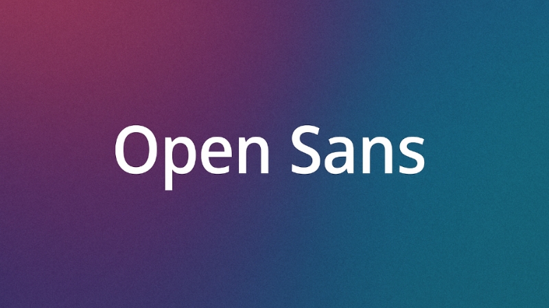
Toggle1. Open Sans

Feature
Details
Category
Sans-serif
Personality
Neutral, legible, and friendly without being informal
Strengths
Versatility, wide range of weights, screen-optimized
Ideal Use Cases
Blogs, corporate sites, tech, non-profits, long-form content
Pairs Well With
More expressive or decorative headline fonts
Elementor Tip
Use Open Sans for body text to create contrast with bolder headers
Open Sans is a classic for a reason. Its shapes are neutral and open, which gives it excellent readability on all screen sizes.
It doesn’t fight for attention, and that’s exactly what makes it powerful in body text; it just works, even at small sizes or in dense paragraphs. It supports multiple languages and comes in a wide variety of weights, so if you’re building something global, you’re covered.
In Elementor, it’s perfect for large chunks of copy. Set it as your default body font, and then go with something more dramatic, like Montserrat or Playfair Display, for headings. This mix creates clarity and keeps your layout interesting.
2. Roboto
Feature
Details
Category
Sans-serif
Personality
Friendly, contemporary, slightly technical
Strengths
Compact, modern look, multiple weights
Ideal Use Cases
App landing pages, SaaS platforms, tech blogs
Pairs Well With
Classic serif fonts (e.g., Georgia, Merriweather) for contrast
Elementor Tip
Leverage Roboto’s condensed width to fit more text into tight layouts
Roboto was built with screens in mind, which means it looks especially crisp on mobile. Its rounded letters feel just human enough, but the overall vibe leans tech-savvy.
If your site leans toward clean UI or fast, direct information (think: dashboards, product listings), Roboto can do a lot of the heavy lifting.
Within Elementor, use Roboto to create hierarchy: regular for paragraph text, bold or medium for headings, and light for subtle supporting text. It also adapts well to different languages, a great plus for multilingual sites.
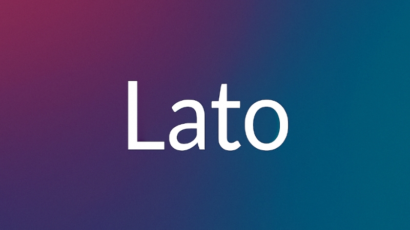
3. Lato

Feature
Details
Category
Sans-serif
Personality
Warm, stable, professional
Strengths
Balanced curves, readability, and subtle character
Ideal Use Cases
Education, healthcare, service industries
Pairs Well With
Serif fonts (like Lora or Crimson Text) for headlines
Elementor Tip
Use Lato across mobile and desktop views — it scales beautifully
Lato feels effortless. There’s nothing showy about it, but the small design flourishes (like the rounded ‘O or subtly curved ‘a’) give it a warm tone that makes it feel human, but not too casual.
It’s got a sturdy rhythm when used in paragraphs and remains readable without drawing attention to itself.
Elementor makes it easy to pair Lato with something more stylized for your headlines. Lora is a great match if you want contrast and elegance without losing cohesion. Lato also holds up well under varying weights and sizes, something that’s not true for every sans-serif.
4. Montserrat
| Feature | Details |
| Category | Sans-serif |
| Personality | Bold, geometric, urban |
| Strengths | Attention-grabbing, stylish, wide letterforms |
| Ideal Use Cases | Portfolios, creative agencies, and startup homepages |
| Pairs Well With | Subtle sans-serifs like Open Sans or Muli for body text |
| Elementor Tip | Use bold weights for big headers; avoid using it everywhere |
This one’s got presence. Inspired by signage in Buenos Aires, Montserrat brings visual weight and style. It feels very “now,” which makes it a go-to for brands that want to feel edgy or cutting-edge.
Its rounded structure gives it boldness, but too much of it can overwhelm the page.
That’s why Montserrat is best reserved for headers and titles. Let it do the shouting, then bring in something lighter and easier on the eyes for paragraphs, think Muli or Open Sans.
Elementor’s weight controls let you balance this perfectly: bold or extra-bold for main headlines, and lighter weights or another font for everything else.
5. Raleway

Feature
Details
Category
Sans-serif
Personality
Elegant, minimalist, refined
Strengths
High-end feel, extended character spacing, graceful curves
Ideal Use Cases
Fashion, design, portfolio, editorial websites
Pairs Well With
Serif fonts for body text (like Georgia or Lora)
Elementor Tip
Increase letter-spacing slightly in headlines for an upscale look
Raleway started as a display typeface, and it shows. There’s an elegance baked into it, especially in its thinner weights.
It’s not the most readable at small sizes, which makes it better for headlines and feature text. You can get away with using it for short paragraphs, but it’s best kept bold and big.
In Elementor, you can control letter spacing easily, and Raleway loves spacing. It looks luxurious with a little extra breathing room. If you’re building a fashion blog or a creative agency homepage, this font instantly levels up the aesthetic.
6. Oswald
@bettersheets.coFollow to get better 👍♬ i am obsessed with this – mallorie
Feature
Details
Category
Sans-serif
Personality
Condensed, bold, no-nonsense
Strengths
Fits tight spaces, strong vertical lines
Ideal Use Cases
News sites, tech blogs, event posters
Pairs Well With
Wider, softer sans-serifs for body (like Poppins or Work Sans)
Elementor Tip
Great for mobile — saves horizontal space while staying legible
Need to fit a lot of headline text into a tight spot? Oswald’s got you. Its condensed form is a lifesaver on mobile or narrow columns.
It’s punchy, assertive, and surprisingly readable even at smaller sizes. That makes it excellent for headlines, menus, and category labels.
Pair it with a font that has some horizontal openness to avoid a squished feeling. In Elementor, use Oswald for header text in sidebars or cards where space is at a premium. Just don’t use it for paragraphs, you’ll tire the reader out quickly.
7. Georgia

Feature
Details
Category
Serif
Personality
Traditional, reliable, readable
Strengths
Excellent for body text, web-safe, works well on screens
Ideal Use Cases
Law firms, universities, and news websites
Pairs Well With
Clean sans-serifs (e.g., Roboto, Lato)
Elementor Tip
Use for body text and contrast with bold sans-serif headers
Georgia is one of those fonts that just works, especially for long-form reading. It was designed to be readable even at small sizes on low-res screens, and it still holds up beautifully today.
There’s a formality to it, but not in a stiff or outdated way. It feels trustworthy.
For Elementor, Georgia makes a great default font for paragraphs. Pair it with a modern sans-serif like Montserrat or Poppins for a high-contrast, editorial feel.
8. Times New Roman

Feature
Details
Category
Serif
Personality
Classic, formal, instantly recognizable
Strengths
Familiarity, screen-safe, strong heritage
Ideal Use Cases
Academic websites, legal publications, and history-themed projects
Pairs Well With
Display fonts or modern sans-serifs
Elementor Tip
Use in uppercase headlines or for block quotes to highlight legacy feel
It’s easy to write this one off as overused, but in the right hands, Times New Roman can make a statement, especially when used sparingly.
That familiarity brings a sense of legitimacy, and if you lean into it with intention (think all-caps titles or pull quotes), it becomes less “default” and more “editorial.”
In Elementor, don’t use this font everywhere. But for certain brands, especially academic or historical, it adds weight. Keep it in larger font sizes and avoid using it in long, unbroken paragraphs unless you’re going for that traditional book-like feel.
9. Garamond
| Feature | Details |
| Category | Serif |
| Personality | Sophisticated, elegant, literary |
| Strengths | Historic charm, distinctive curves, great for long reads |
| Ideal Use Cases | Art galleries, luxury brands, editorial websites |
| Pairs Well With | Light sans-serifs (like Lato or Source Sans Pro) |
| Elementor Tip | Let Garamond breathe by using it with generous spacing and padding |
If you want your site to feel refined, cultured, or timeless, Garamond is your go-to. It has the same air of tradition as Times New Roman, but with softer edges and more graceful details.
Perfect for brands that want to evoke history or luxury.
In Elementor, don’t cram it into tight layouts. This font shines when given space, think minimalist layouts, high contrast text and background, and clean use of imagery. Pair it with a sans-serif to keep the overall feel balanced and fresh.
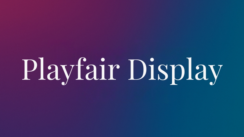
10. Playfair Display

Feature
Details
Category
Display Serif
Personality
Dramatic, stylish, vintage-inspired
Strengths
High contrast, expressive, draws attention
Ideal Use Cases
Fashion blogs, editorial sites, upscale branding
Pairs Well With
Simple sans-serifs (like Open Sans or Nunito) for balance
Elementor Tip
Best used in large headers or feature titles, not for paragraphs
You don’t use this one because it’s safe; you use it because you want your headlines to pop. Playfair Display feels like an old magazine cover brought into the digital age.
Inside Elementor, apply this font to hero sections, large page titles, or feature callouts. Avoid pairing it with another ornate font; let it be the star. And don’t use it for body text, it’s too tight and stylized for long reading.
11. Merriweather

Feature
Details
Category
Serif
Personality
Warm, friendly, balanced
Strengths
Designed for screen reading, approachable but stylish
Ideal Use Cases
Blogs, content-heavy sites, storytelling-focused pages
Pairs Well With
Roboto, Poppins, or Open Sans
Elementor Tip
Use varying weights to create text hierarchy without switching fonts
It’s readable, personable, and feels a bit more modern than some older serif fonts. Merriweather is especially good when your website includes a lot of text, such as case studies, feature pieces, or long product descriptions.
In Elementor, Merriweather works beautifully as either a headline or body font. Because it comes in a variety of weights, you can build contrast just by adjusting those settings rather than changing font families. That keeps your design clean and consistent.
12. Poppins
Feature
Details
Category
Sans-serif
Personality
Round, modern, friendly
Strengths
Geometric shapes, readable and easy on the eyes
Ideal Use Cases
Startups, agencies, lifestyle brands
Pairs Well With
Classic serif fonts (like Georgia or Crimson Text)
Elementor Tip
Use regular or medium weights for body, and bold for big headings
Poppins is like Montserrat’s friendlier cousin. It’s got geometric roots but softened by round edges. This gives it a polished but welcoming look that fits perfectly on modern websites.
In Elementor, use it for both headers and body text to maintain a unified look. If you’re building something minimal and modern, or a site aimed at younger audiences, Poppins should be high on your list.
13. Nunito

Feature
Details
Category
Sans-serif
Personality
Approachable, round, informal, but clear
Strengths
Great spacing, good on mobile, gentle tone
Ideal Use Cases
Educational sites, apps, and youth-focused brands
Pairs Well With
Serif fonts like Lora or Playfair for added contrast
Elementor Tip
Great for UI text (buttons, menus, labels) due to its clarity
Nunito feels casual without being childish. It’s got a charm that works well for user-friendly platforms, think onboarding flows, tutorials, non-profit websites, etc. It feels safe, but not boring.
With Elementor, Nunito’s balanced weights allow you to create a full hierarchy without switching fonts. It’s especially effective in apps or dashboard-style layouts where readability matters but formality would feel out of place.
14. Lora

Feature
Details
Category
Serif
Personality
Graceful, artistic, refined
Strengths
Calligraphic feel, strong readability, feminine touch
Ideal Use Cases
Lifestyle blogs, beauty brands, and creative portfolios
Pairs Well With
Simple sans-serifs (like Poppins or Lato)
Elementor Tip
Works beautifully as large body text or in elegant headings
Lora has this soft, almost poetic quality to it. There’s a calligraphic influence in the strokes, which makes it more expressive than your average serif.
But it’s still practical, it reads well, scales nicely, and doesn’t feel stuffy.
On Elementor, try using Lora for paragraphs on feature pages or long-form blog posts. Pair it with a geometric sans-serif like Poppins in your headers for a gorgeous contrast.
15. Crimson Text

Feature
Details
Category
Serif
Personality
Classic, scholarly, refined
Strengths
Elegant letterforms, print-inspired, serious tone
Ideal Use Cases
Literature websites, academic blogs, and publishing-focused content
Pairs Well With
Clean sans-serifs like Roboto or Source Sans Pro
Elementor Tip
Use with ample line-height and margin to show off its grace
This font feels like it belongs in a hardcover book. It has that kind of gravitas, elegant serifs, beautiful italic forms, and subtle detailing. It gives off an academic, literary tone without being overly formal or rigid.
On Elementor, Crimson Text works best when it’s allowed room to breathe. Use it in text blocks where readability matters and where the audience appreciates a thoughtful, well-crafted layout. Headlines? Maybe. But body text? Absolutely.
16. Pacifico
| Feature | Details |
| Category | Handwriting |
| Personality | Playful, casual, fun |
| Strengths | Friendly brush strokes, cheerful energy |
| Ideal Use Cases | Personal blogs, crafts, kids’ sites, casual product brands |
| Pairs Well With | Clean sans-serifs for balance (e.g., Open Sans, Work Sans) |
| Elementor Tip | Use only for short headlines or callouts to avoid overwhelming the layout |
It’s playful, it’s energetic, and it’s bursting with personality. But, it’s also a lot.
You wouldn’t use Pacifico for a paragraph of text (unless you want readers to rage-quit your site), but for a quirky header, a product label, or a handwritten-style section title? It’s perfect.
In Elementor, use Pacifico sparingly. A “Welcome” headline, maybe a testimonial name, or a section for something handmade or whimsical. It pairs well with grounded fonts that give structure and readability.
17. Dancing Script

Feature
Details
Category
Handwriting
Personality
Vintage, romantic, flowing
Strengths
Cursive style, charming rhythm
Ideal Use Cases
Wedding sites, personal blogs, boutique shops
Pairs Well With
Serif fonts like Georgia or modern sans like Lato
Elementor Tip
Increase size and spacing — it needs room to shine
There’s a nostalgic quality here. Dancing Script feels like something out of a handwritten invitation or a classic storefront.
It’s expressive and personal, but also readable, more so than many cursive fonts.
In Elementor, it can be gorgeous when used sparingly. Try it in larger headers or small callouts that require a personal touch.
But always test how it reads on mobile, and make sure there’s enough contrast between text and background to keep it accessible.
18. Yellowtail
Feature
Details
Category
Handwriting
Personality
Retro, energetic, mid-century vibe
Strengths
Unique curves, bold presence, angled script
Ideal Use Cases
Vintage-themed designs, retro branding, and creative blogs
Pairs Well With
Neutral sans-serifs like PT Sans or Roboto
Elementor Tip
Great for logos, hero headers, or CTA text — use sparingly
It’s got a retro zing, almost like a 1950s soda ad. Yellowtail grabs attention fast. That’s great for fun, nostalgic websites, or for modern brands borrowing from vintage styles.
In Elementor, you’ll want to keep it large and short, think one-line headers, call-to-actions, or stylized logos.
It’s not built for paragraphs or small labels. And if you pair it with another font, go plain and quiet to avoid a font clash.
19. Source Sans Pro

Feature
Details
Category
Sans-serif
Personality
Clean, neutral, professional
Strengths
Highly legible, multiple weights, built for UI
Ideal Use Cases
Corporate sites, blogs, admin dashboards, media
Pairs Well With
Serif fonts like Merriweather or Lora for contrast
Elementor Tip
Ideal for building a strong visual hierarchy with just one font family
This font was Adobe’s first open-source typeface, and it shows the kind of polish and intention you’d expect from that. It’s extremely legible, scalable, and straightforward. No unnecessary flair. It just reads well.
Use it when you want your website to feel clean, organized, and unfussy. Especially great if you’re working on a client site where content clarity is critical.
In Elementor, Source Sans Pro is a solid choice across both headings and body copy. Use heavier weights for headlines, lighter ones for paragraph text, and you’ll have a unified, minimal typographic system with almost no effort.
20. PT Sans

Feature
Details
Category
Sans-serif
Personality
Slightly technical, crisp, condensed
Strengths
Compact spacing, strong multilingual support, and screen-friendly
Ideal Use Cases
Tech startups, multilingual websites, and news portals
Pairs Well With
Rounded fonts like Nunito or Quicksand for warmth
Elementor Tip
Avoid very small sizes — condensed shapes can hurt legibility
PT Sans was developed as part of a Russian public project to support Cyrillic alphabets — but it’s found global popularity thanks to its sleek, condensed form and professional tone.
It’s efficient, which makes it ideal when you need to get more text into tight spaces without breaking layout.
In Elementor, it shines in navigation menus, sidebars, and card headers. Just make sure you’re using a large enough font size, especially on mobile, because its compact design can feel a little tight if you go too small.
PT Sans is also a smart pick if you’re working on a multilingual site; its extended language support is a real asset.
21. Ubuntu

Feature
Details
Category
Sans-serif
Personality
Friendly, open, slightly quirky
Strengths
Unique style, warm tone, great legibility
Ideal Use Cases
Tech blogs, education platforms, and community-based sites
Pairs Well With
Traditional serifs like Lora or Garamond
Elementor Tip
Use for headers or subheadings where you want a subtle personality boost
Ubuntu feels a little different — in a good way. It’s modern but doesn’t feel sterile. The rounded terminals give it personality without going overboard, and the rhythm of the type makes it approachable.
It was originally designed for the Ubuntu OS, but it fits right in on the web.
In Elementor, it’s great when you want to set a friendlier tone. Headers, subheadings, or buttons feel more “human” when styled with Ubuntu. Don’t overuse it in long paragraphs — pairing it with a calmer serif helps ground it.
22. Exo
| Feature | Details |
| Category | Sans-serif |
| Personality | Futuristic, tech-forward, sleek |
| Strengths | Wide weight range, sharp lines, angular shapes |
| Ideal Use Cases | SaaS products, fintech sites, games, modern portfolios |
| Pairs Well With | Soft sans-serifs (like Nunito or Quicksand) to tone down its edge |
| Elementor Tip | Use lighter weights for body; reserve heavy weights for bold headlines |
Exo has a very digital, high-tech vibe. The letterforms are precise and geometric, with sharp edges that give off a bit of a sci-fi feel.
If you’re building a site for a tech product, a futuristic app, or even a creative portfolio, Exo can make it feel sharp and forward-thinking.
In Elementor, use Exo to make your headlines stand out — particularly when paired with motion or visual effects. If you’re using it for paragraph text, go with a lightweight and increase line height slightly to keep it comfortable to read.
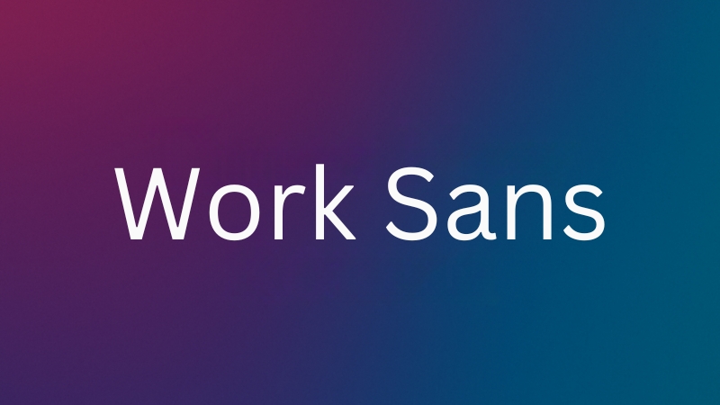
23. Work Sans

Feature
Details
Category
Sans-serif
Personality
Clear, slightly rounded, functional
Strengths
Excellent readability, consistent structure, modern tone
Ideal Use Cases
Corporate websites, content-heavy layouts, product marketing
Pairs Well With
Eye-catching display fonts like Anton or Playfair Display
Elementor Tip
Works well at all sizes — headings, subheadings, body, even buttons
This font was literally designed for digital interfaces. It’s clean, reliable, and consistent without feeling overly mechanical. The slightly rounded shapes soften it just enough to avoid a cold or boring tone.
It’s especially effective for professional websites that need hierarchy and clarity without a lot of fuss.
In Elementor, you can set Work Sans as your base font and build your entire typography system off of it, it scales well, pairs easily, and looks sharp across screen sizes.
24. Muli (now known as Mulish)
View this post on Instagram
A post shared by 🇺🇦 𝘞 𝘌 𝘉 𝘍 𝘖 𝘕 𝘛 𝘚: Шрифти для твоїх дизайнів (@webfonts)
Feature
Details
Category
Sans-serif
Personality
Minimalist, lightweight, relaxed
Strengths
Great for body text, clean lines, gentle rhythm
Ideal Use Cases
Blogs, reading-focused sites, news platforms
Pairs Well With
More expressive or bold display fonts like Raleway or Anton
Elementor Tip
Keep it at medium size for best readability — too small and it fades
Muli doesn’t get in the way. It’s understated and subtle, which makes it perfect for body text or secondary information. If you’re designing a website with lots of articles or documentation, this font helps keep everything clean and distraction-free.
In Elementor, Muli is a great default font for blog posts or longer pages. Try combining it with a strong sans-serif header (Montserrat, for example) for that nice quiet/loud dynamic.
25. Anton

Feature
Details
Category
Sans-serif (Display)
Personality
Bold, aggressive, commanding
Strengths
Thick strokes, uppercase design, max impact
Ideal Use Cases
Hero headers, promotional banners, attention-grabbing CTAs
Pairs Well With
Thin fonts like Muli or Open Sans for contrast
Elementor Tip
Use sparingly — Anton is for headlines only, never body text
Anton is not shy. It’s an all-caps, block-style typeface that instantly commands attention. If you want a site that shouts “LOOK HERE,” Anton’s your guy.
It works especially well on landing pages where a headline needs to hook users in fast. If you’re using a parent page in WordPress to organize related content, Anton can help establish a strong visual hierarchy right from the top.
In Elementor, this is a display-only font. Headlines, banners, or even slide titles are great uses. Give it plenty of space and pair it with a simple, clean font to avoid chaos.
Also, spacing matters here — try letter-spacing tweaks to keep it readable.
26. Quicksand

Feature
Details
Category
Sans-serif
Personality
Soft, rounded, youthful
Strengths
Geometric base, friendly curves, easy to read
Ideal Use Cases
Wellness sites, creative businesses, lifestyle brands
Pairs Well With
Serious serifs like Merriweather or Georgia for contrast
Elementor Tip
Try light weights for body and bold for playful section headers
Quicksand brings a certain softness and approachability. Its rounded terminals and subtle geometric design make it great for wellness, lifestyle, or kid-focused websites.
In Elementor, Quicksand works nicely for UI elements — buttons, labels, section headers. Use bolder weights when you want to draw attention, but keep your line-height comfortable if you’re using it in body text.
For a clean contrast, pair it with something like Garamond or Lora.
Related Posts:
- WordPress Alternative - Top 5 Website Builders for…
- What Is a Parent Page in WordPress? A Beginner’s…
- Cybercrime’s Top 5 Victims - Industries You Should…
- Top 6 School Safety Technologies Every School Needs in 2025
- How to Easily Convert Pictures to PDF on Your iPhone…
- Best Smart Home Devices to Upgrade Your Living Space


